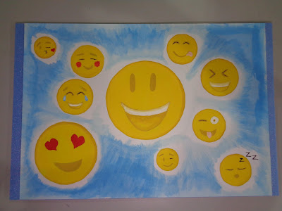
Final Assignment

Journey to Happiness.

My art work
11th Assignment

Color Blind Test (Stuffed Toy Design)

A specific pattern of which colors are put together can help form a letter or a number, however color blind individuals cannot see these numbers.


Art by me.
10th Assignment

Camouflage Colors (Vase)

I colored a Vase in the basic colors of a jungle camouflage design. The colors are light green, deep green and brown. The colors are similar to that of which you see in the jungle.


Vase design by me.
9th Assignment

Bright and Dark colors (Disney Character Design)

I chose Mulan as my character and colored the background in many different bright colors and i colored her skin with neutral colors but her hair with dark black to create contrast of light and dark. The colors are split in half to represent both sides of Mulan in the films, the lady like side that is the daughter in the Fa family and the warrior side who went to war in China.


Art by me.
8th Assignment

Cool And Warm colors (Character Design)

I design my own character having both cool and warm tones in it. The most obvious of cool and warm color is her hair which has both yellow and blue, a warm and cool color. The red details on the cloths also contrast the background color which is green.


Designing the character.


After painting.
7th Assignment

Analogous Colors (Interior Design Art)

Analogous colors are groups of three colors that are next to each other on the color wheel, with one being the dominant color, which tends to be a primary or secondary color, and one either on the side of the color. Red, red orange and red violet are an example.


Red is the dominant color.

Original Image Reference.

6th Assignment

3 Colored Scenery.

For this assignment i can only use three colors to create a scene. The colors i chose were primary colors in different tones.


Art work by me.
5th Assignment

Psychology of Color.

It is known that every different age group prefers a different set of colors. The below painting of mine shows what colors goes best with what age group.


For babies: Pastel or bright neon colors to stimulate the developing eyesight.
For children: Bright and exiting colors to represent happiness and joy.
For teenagers: Contrasting colors or neon colors to represent the teens way of individualizing oneself.
For adults: Dark colors with cooler tones to represent the professionalism in the working world.
For middle age: Dark colors with neutral to warm tones for a more subtle yet different appearance.
For golden age: Lighter colors with neutral to cool tones to represent the calmness of old age.
4th Assignment

Different Type of Complementary Colors.

The types used in my painting are Split Complementary, Square, Tetrad and Triad.


Art work done by me.

Below are some examples of how to locate the type of complementary color.


3rd Assignment

Color Value (Tone and Tint)

Colors have many variations in tone and tint depending on the amount of black or white added. Bellow are primary colors mixed with different amounts of black or white to achieve a color darkening or intensifying effect.


Both are done by me.
2nd Assignment

Complementary Color

Complementary Colors are colors that contrast each other. They are also the colors that are in opposite poles from each other on the color wheel. For example, purple and yellow, or red and green.


Complementary color chart by me.
1st Assignment

Color Wheel.

I learned one of the most basic to art which is the color wheel.
The Primary colors are Blue, Red and Yellow which cannot be mixed or formed from other colors.
The Secondary colors are Purple,Orange and Green which is a mixture of two primary colors.
The Tertiary colors are colors that are a mixture of both Primary and Secondary colors.


Color Wheel by me.
5th Assignment
Creating Self Branding Name Poster.


I created a poster of my name using the principles of visual perspective and 3 dimensional effects.


The Final Poster created to brand myself.


The self character design i used for the poster, also created in Ai.
4th Assignment
Tracing alphabet shapes on Adobe Illustrator.


3rd Assignment
Alphabet with 3 Visual Points(Mahjong Paper).


Powered by Blogger.