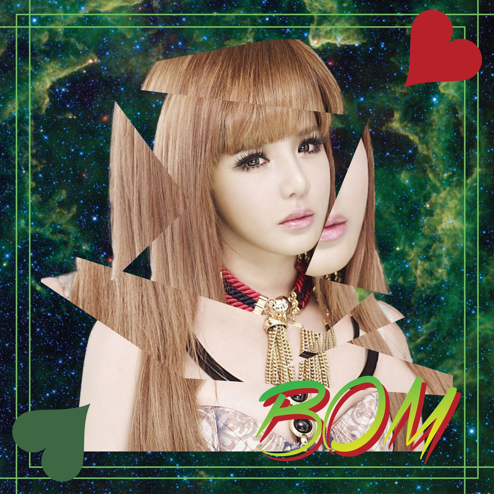
Computer Graphics Final (Album Cover)
The album cover i did was for a Korean pop girl group 2NE1. I did an album cover for each individual member (4). The covers mainly consist of geometric designs. Each album also contains a Card Symbol which are the Spade, Heart, Diamond and Club.
Here are some of the processes taken during the designing of the covers.
This assignment was for me to Rebrand or create a new logo for any brand i choose. I chose the XBOX brand because i felt that they are falling behind lately in the market.
I made a few sketches before choosing a design i liked.
I kept the typeface for the XBOX text the same and i maintained the green color.
Here are a few products created for the brand.
This assignment required me to go around town to find companies or brands with bad or misleading logos then choose 1 to make a redesign.
Tokyo Marine
Tokyo Marine is actually an insurance brand, but their logo
doesn’t seem to be able to represent their brand well. With the ball and sphere
like shape, it confuses viewers into thinking that it probably is a parcel
service. The logo is completely different from its brand.
Public Bank
Public Bank’s logo is simple and easily understandable. But
the logo has no representation or connection to the bank. The logo is only
depicting 2 octagons overlapping each other and no relation to money or banking.
If it wasn’t for the brand being well known, the logo itself would be very
misleading.
The Border City
The Border City is an interactive café that allows you to
enjoy a meal and play board games. But the logo is not a good representation of
the café. From what I see, it has a European style building to represent its
food, they serve western food, and leaves, but I’m not sure what it represents.
I also want to point out that it’s colour scheme of blacks and greys is very
dull and boring.
Hong Leong Bank
The logo for Hong Leong Bank is simple, so to
say. But what does in mean? The shape and the form doesn’t represent a bank in
my opinion. Even though, it has simple and attractive colours, I can’t help but
be very annoyed by the fact that I don’t know what the logo represents. Like
Public Bank, if it wasn’t an already well known bank, the logo would be
unrecognizable.
Perfect Ceiling Lab
All I can say is that the logo is inappropriate. The logo
looks like a clothing brand or an accessories brand. The font and typography of
the words are very poorly done. Not only does it not represent a ceiling
contractor company, it pushes people away. The colour scheme is simple but that
is it.
Le Miz Hair Studio
Le Miz would be very recognizable to those
who’ve been to the hair saloon, it has a simple readable font and a unique
name. But to the passer by, this logo would not be recognizable as it doesn’t
have any indication of it being related to hair or beauty. The typography is an
eyesore to me, because I think the ‘Le’ and ‘Miz’ are too far apart from each
other.
3 Bags Full
This logo, although simple and understandable, doesn’t seem
to have a good depiction of a restaurant. The name of the restaurant and café is
and interesting play of words and reference to the nursery rhyme “Bah bah Black
Sheep”.
Black Bunny
Black Bunny is a beauty saloon that provide nail, facial and
body care services. But the name and logo is undoubtedly misleading. The rabbit
on its logo could mean anything from a pet shop, to a boutique and the font or
typeface used for the words are an eyesore. All in all, the logo and the name
are very inappropriate for a beauty saloon.
Jotun
Jotun is a paint brand, but it is represented by a confusing
logo. The logo seems to depict a penguin or what looks like a penguin and a
globe behind it. Other that a simple colour scheme and typeface, the logo has
no relation with paint or the brand.
Star Picker Audio
At first glance, this logo looks like represent a company
related to nature because the logo looks like a tree. But the company is
actually an audio shop. Nothing more to say other than a logo that is
inappropriate.
I chose star picker audio as my redesign brand.
As u can see, i redesign the logo with a simply black and white theme. I also incorporated a human like figure holding a star to represent the name of the brand 'Star Picker'. The 5 wavy lines represent the bars of a music sheet that comes from the word audio in the brand.
Below is a sample name card for the brand.
Blog Archive
-
▼
2016
(15)
- ► 04/24 - 05/01 (7)
- ► 03/06 - 03/13 (3)
- ► 02/28 - 03/06 (2)
-
►
2015
(35)
- ► 12/06 - 12/13 (8)
- ► 10/04 - 10/11 (1)
- ► 09/27 - 10/04 (18)
- ► 09/06 - 09/13 (5)
- ► 07/26 - 08/02 (2)
- ► 06/21 - 06/28 (1)
Powered by Blogger.


